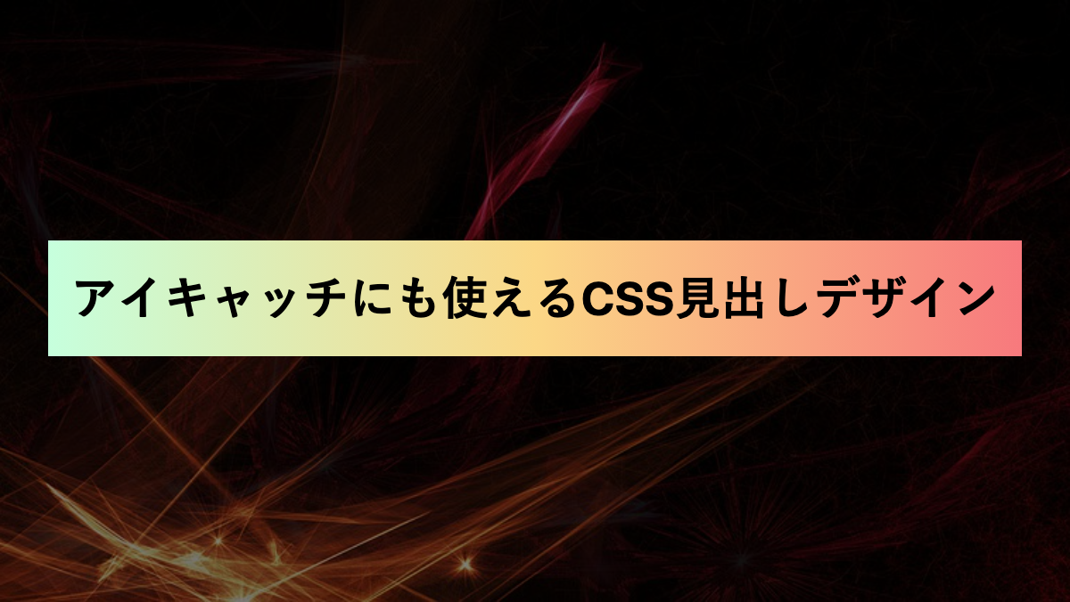
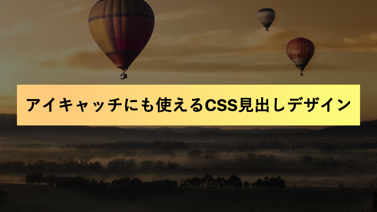
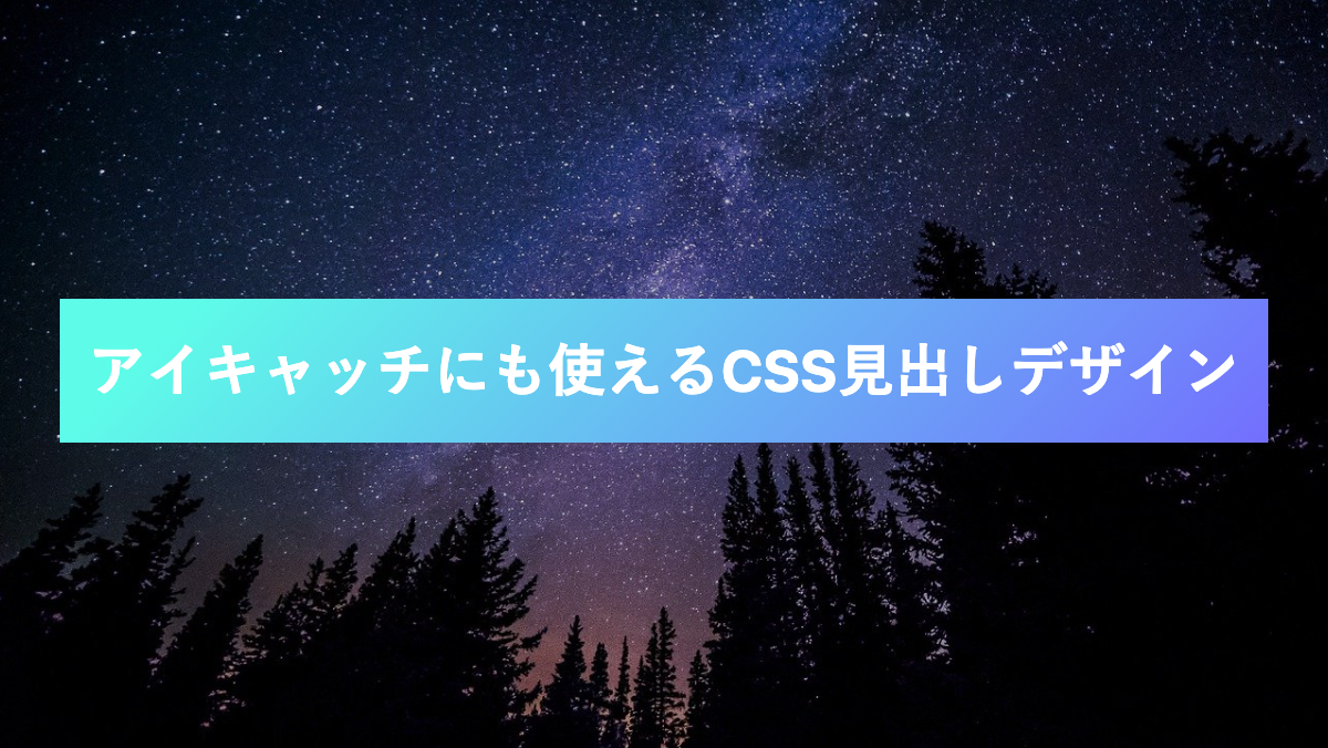
今回は「linear-gradient」関数などを使用しCSSでグラデーションかけた見出しデザインを紹介します。
グラデーションを入れることで多彩な色の表現が可能となり、オリジナリティのある目を引く見出しデザインをつくることができます。
運営しているブログやWEBサイトのカラーに合うグラデーションをコピペして活用してください。
また以下は様々なグラデーションパターンをCSSでコピペできるサービスです
お気に入りのパターンを見つけたら、見出しデザインの「background-image」プロパティと置き換えて使用してくださいね。
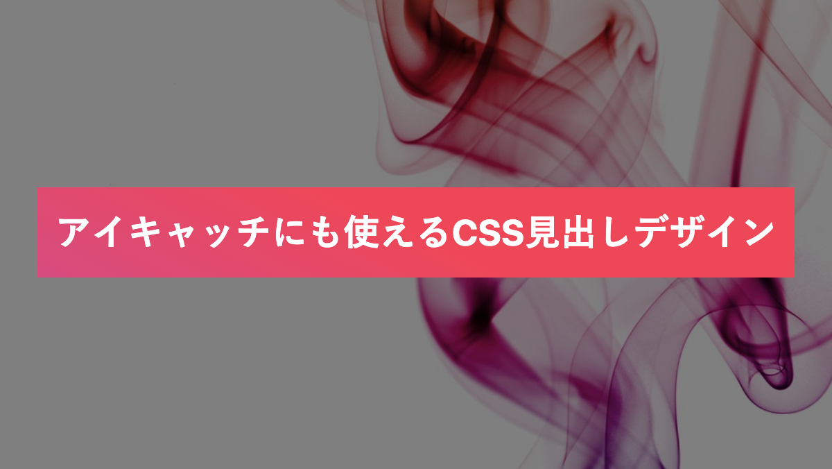
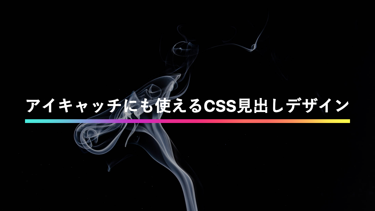
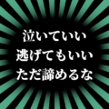
グラデーションの下線を引いた見出し
backgroundでlinear-gradientを指定。background-sizeの高さを10%にして、background-positionをbottomにすることで下線にしています。
CSS表示
h2 {
    position: relative;
    padding: 0.5rem;
    margin-bottom: 0.2rem;
    color: white;
    background: linear-gradient(90deg, #00DBDE 0%, #FC00FF 100%);
    background-repeat: no-repeat;
    background-size: 100% 10%;
    background-position: bottom;
    font-weight: bold;
    font-size: 26px;
}
文字や背景画像が変更可能。また画像を含めたHTML・CSSを取得できます
文字を二色にして下線を引いた見出し
linear-gradientで黒と濃いピンクの2色に色分け。-webkit-background-clip: text;で文字にグラデーションをかけてます
CSS表示
h2 {
    position: relative;
    margin-bottom: 0.2rem;
    border-bottom: 5px solid #ED0081;
    background: linear-gradient(180deg, black 0 50%, #ED0081 50%);
    -webkit-background-clip: text;
    color: transparent;
    font-weight: bold;
    font-size: 26px;
}
文字や背景画像が変更可能。また画像を含めたHTML・CSSを取得できます
下線をグラデーションにした見出し
linear-gradientで真ん中を白くし、「カスタムプロパティ(--main-color)」で指定した緑色が両端に表示されるようグラデーションをかけてます。
CSS表示
h2 {
    --main-color: #94e99a;
    position: relative;
    padding: 0.5rem 0;
    margin-bottom: 0.5rem;
    background-image: linear-gradient(90deg, var(--main-color) 0%, white 30% 70%, var(--main-color));
    background-repeat: no-repeat;
    background-size: 100% 0.3rem;
    background-position: bottom;
    color: var(--main-color);
    font-weight: bold;
    font-size: 26px;
}
文字や背景画像が変更可能。また画像を含めたHTML・CSSを取得できます
背景をグラデーションにした見出し
linear-gradientで背景を緑がかったグラデーションにしています
CSS表示
h2 {
    padding: 0.8rem;
    margin-bottom: 0.2rem;
    background-image: linear-gradient(to right, rgb(182, 244, 146), rgb(51, 139, 147));
    background-repeat: no-repeat;
    font-weight: bold;
    font-size: 26px;
}
文字や背景画像が変更可能。また画像を含めたHTML・CSSを取得できます
枠をグラデーションにした見出し
background-imageに2つのlinear-gradientを指定。最初の指定で黒背景にし、次の指定で黒背景の背面にグラデーションを設定。黒背景のサイズを0.5rem縮めてグラデーションの枠線を作成しています。
CSS表示
h2 {
    position: relative;
    padding: 1rem;
    border-radius: 0.2rem;
    margin-bottom: 0.5rem;
    background-image:
        linear-gradient(black 0 100%),
        linear-gradient(134.6deg, rgba(158, 150, 252, 0.85) -1%, rgba(211, 133, 176, 1) 16.9%, rgba(249, 116, 146, 1) 43.7%, rgba(255, 158, 136, 1) 66.9%, rgba(254, 228, 172, 1) 94.8%);
    background-position: center, center;
    background-repeat: no-repeat, no-repeat;
    background-size: calc(100% - 0.5rem) calc(100% - 0.5rem), 100% 100%;
    color: white;
    font-weight: bold;
    font-size: 26px;
}
文字や背景画像が変更可能。また画像を含めたHTML・CSSを取得できます
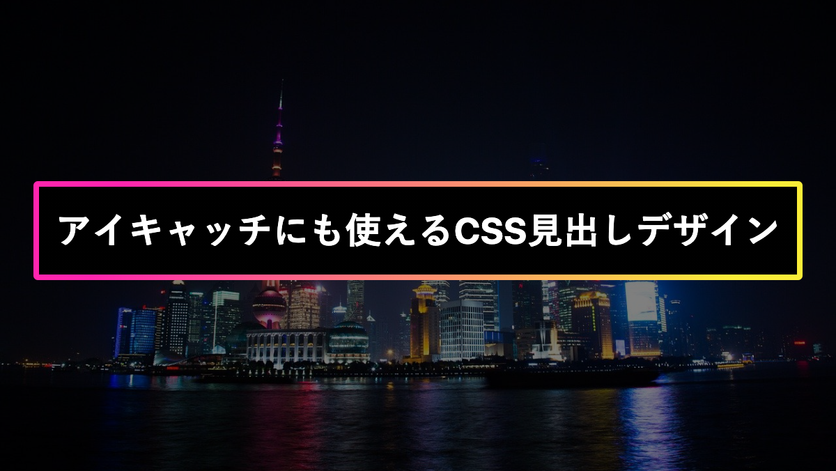
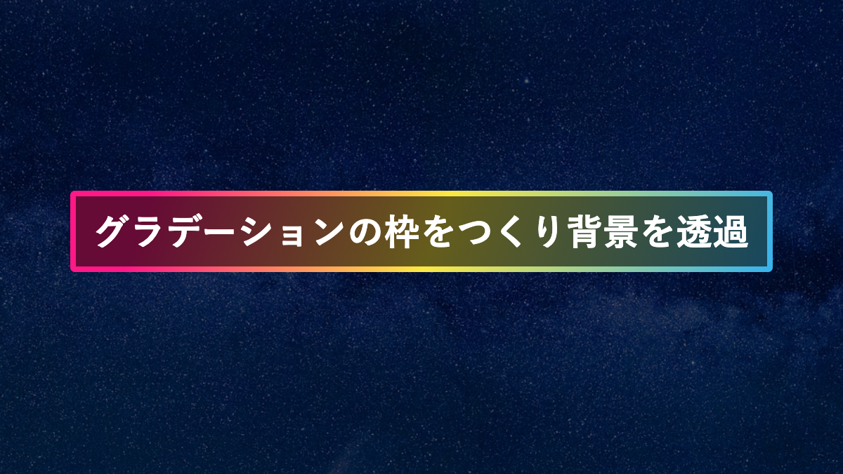
枠をグラデーションにして透過させた見出し
「linear-gradient」でrgbaを指定し透過したグラデーション枠を作っています。
CSS表示
h2 {
    position: relative;
    padding: 1rem;
    border-radius: 0.2rem;
    margin-bottom: 0.5rem;

    background-image:
        linear-gradient(rgba(0, 0, 0, .7) 0 100%),
        linear-gradient(315deg, rgba(249, 7, 252, 0.5) 0%, rgba(5, 214, 217, 0.6) 74%);
    ;
    background-position: center, center;
    background-repeat: no-repeat, no-repeat;
    background-size: calc(100% - 0.5rem) calc(100% - 0.5rem), 100% 100%;
    color: white;
    font-weight: bold;
    font-size: 26px;
}
文字や背景画像が変更可能。また画像を含めたHTML・CSSを取得できます
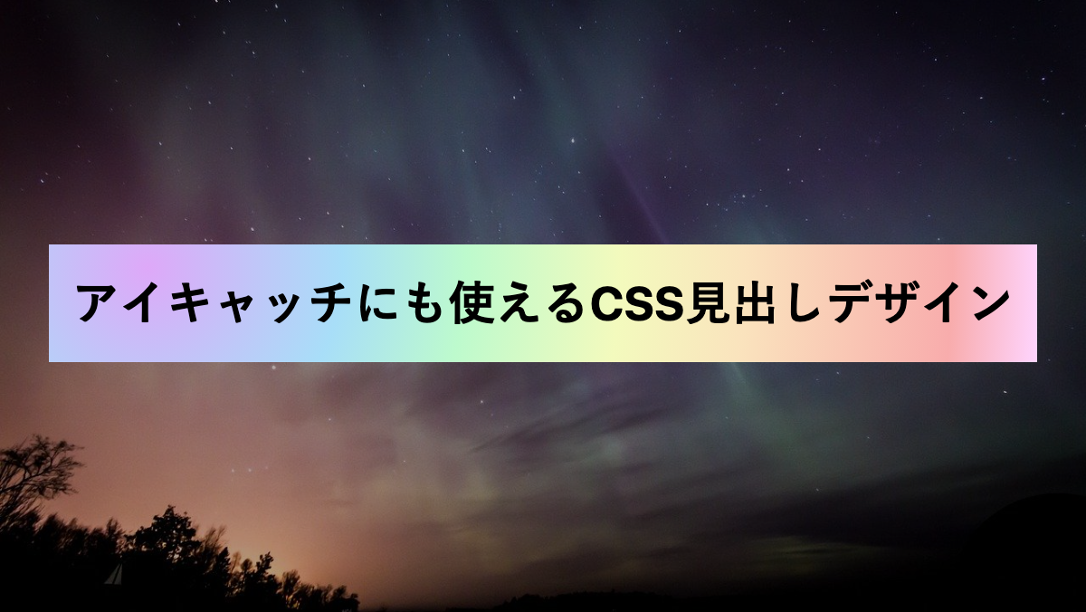
グラデーション背景に枠をつけた見出し
linear-gradientにrgbaで透過グラデーションをかけ、「border」プロパティで枠線を引いています。
CSS表示
h2 {
    padding: 0.8rem;
    margin-bottom: 0.2rem;
    border: 5px solid;
    background-image: linear-gradient(89.9deg, rgba(178, 253, 238, 0.96) -8.1%, rgba(207, 244, 254, 1) 26.3%, rgba(207, 244, 254, 0.48) 47.5%, rgba(254, 219, 243, 0.63) 61.5%, rgba(254, 219, 243, 1) 78.7%, rgba(254, 207, 210, 1) 109.2%);
    font-weight: bold;
    font-size: 26px;
}
文字や背景画像が変更可能。また画像を含めたHTML・CSSを取得できます
背景をグラデーションにした見出し
linear-gradientのto rightで右方向にグラデーションがかかるようにしています。
CSS表示
h2 {
    padding: 0.8rem;
    margin-bottom: 0.2rem;
    background: linear-gradient(to right, rgb(242, 112, 156), rgb(255, 148, 114));
    background-repeat: no-repeat;
    color: white;
    font-weight: bold;
    font-size: 26px;
}
文字や背景画像が変更可能。また画像を含めたHTML・CSSを取得できます
背景をグラデーションにした見出し
linear-gradientで青紫のグラデーションをかけています
CSS表示
h2 {
    padding: 0.8rem;
    margin-bottom: 0.2rem;
    background-image: linear-gradient(109.6deg, rgba(156, 252, 248, 1) 11.2%, rgba(110, 123, 251, 1) 91.1%);
    color: white;
    font-weight: bold;
    font-size: 26px;
}
文字や背景画像が変更可能。また画像を含めたHTML・CSSを取得できます
背景をグラデーションにした見出し
linear-gradientでオレンジからピンクに向かってグラデーションをかけています
CSS表示
h2 {
    padding: 0.8rem;
    margin-bottom: 0.2rem;
    background-image: linear-gradient(109.6deg, rgba(253, 199, 141, 1) 11.3%, rgba(249, 143, 253, 1) 100.2%);
    color: white;
    font-weight: bold;
    font-size: 26px;
}
文字や背景画像が変更可能。また画像を含めたHTML・CSSを取得できます
背景をグラデーションにした見出し
linear-gradientで緑から濃いピンクに向かってグラデーションをかけています
CSS表示
h2 {
    padding: 0.8rem;
    margin-bottom: 0.2rem;
    background-image: linear-gradient(135deg, #A0FE65 10%, #FA016D 100%);
    color: white;
    font-weight: bold;
    font-size: 26px;
}
文字や背景画像が変更可能。また画像を含めたHTML・CSSを取得できます
背景をグラデーションにした見出し
linear-gradientで25degを指定し、左下から右上方向に赤系のグラデーションをかけています
CSS表示
h2 {
    padding: 0.8rem;
    margin-bottom: 0.2rem;
    background: linear-gradient(25deg, #d64c7f, #ee4758 50%);
    color: white;
    font-weight: bold;
    font-size: 26px;
}
文字や背景画像が変更可能。また画像を含めたHTML・CSSを取得できます
背景をグラデーションにした見出し
linear-gradientで緑から赤色にむかってグラデーションをかけています
CSS表示
h2 {
    padding: 0.8rem;
    margin-bottom: 0.2rem;
    background: linear-gradient(to right, #c6ffdd, #fbd786, #f7797d);
    color: black;
    font-weight: bold;
    font-size: 26px;
}
文字や背景画像が変更可能。また画像を含めたHTML・CSSを取得できます
背景をグラデーションにした見出し
radial-gradientのcircle farthest-corner at 10% 20%で左から右方向に向かって黄色系のグラデーションにしています
CSS表示
h2 {
    padding: 0.8rem;
    margin-bottom: 0.2rem;
    background-image: radial-gradient(circle farthest-corner at 10% 20%, rgba(255, 200, 124, 1) 0%, rgba(252, 251, 121, 1) 90%);
    color: black;
    font-weight: bold;
    font-size: 26px;
}
文字や背景画像が変更可能。また画像を含めたHTML・CSSを取得できます
背景をグラデーションにした見出し
linear-gradientでスカイブルーから紫に向かってグラデーションをかけています
CSS表示
h2 {
    padding: 0.8rem;
    margin-bottom: 0.2rem;
    background-image: linear-gradient(135deg, #5EFCE8 10%, #736EFE 100%);
    color: white;
    font-weight: bold;
    font-size: 26px;
}
文字や背景画像が変更可能。また画像を含めたHTML・CSSを取得できます
背景をグラデーションにした見出し
radial-gradientのcircle farthest-corner at 10% 20%で左から右方向に向かってグラデーションをかけてます。
CSS表示
h2 {
    padding: 0.8rem;
    margin-bottom: 0.2rem;
    background-image: radial-gradient(circle farthest-corner at 10% 20%, rgba(222, 168, 248, 1) 0%, rgba(168, 222, 248, 1) 21.8%, rgba(189, 250, 205, 1) 35.6%, rgba(243, 250, 189, 1) 52.9%, rgba(250, 227, 189, 1) 66.8%, rgba(248, 172, 172, 1) 90%, rgba(254, 211, 252, 1) 99.7%);
    font-weight: bold;
    font-size: 26px;
}
文字や背景画像が変更可能。また画像を含めたHTML・CSSを取得できます
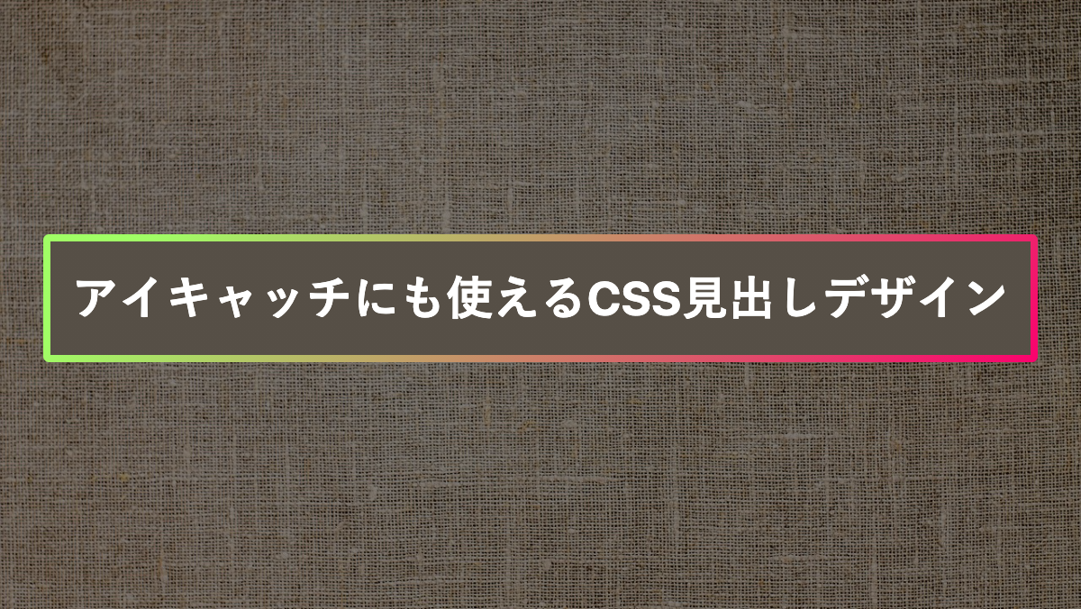
枠をグラデーションにした見出し
「background-image」プロパティに2つの「linear-gradient」を指定。最初の指定で黒に塗り、次の指定でグラデーションをかけてます。黒塗りの背景を0.5rem縮めてグラデーションの枠線を作成。
CSS表示
h2 {
    position: relative;
    padding: 1rem;
    border-radius: 0.2rem;
    margin-bottom: 0.5rem;
    background-image:
        linear-gradient(black 0 100%),
        linear-gradient(122.3deg, rgba(111, 71, 133, 1) 14.6%, rgba(232, 129, 166, 1) 29.6%, rgba(237, 237, 183, 1) 42.1%, rgba(244, 166, 215, 1) 56.7%, rgba(154, 219, 232, 1) 68.7%, rgba(238, 226, 159, 1) 84.8%);
    background-position: center, center;
    background-repeat: no-repeat, no-repeat;
    background-size: calc(100% - 0.5rem) calc(100% - 0.5rem), 100% 100%;
    color: white;
    font-weight: bold;
    font-size: 26px;
}
文字や背景画像が変更可能。また画像を含めたHTML・CSSを取得できます
枠をグラデーションにした見出し
赤→黄色のグラデーションをかけた枠線
CSS表示
h2 {
    position: relative;
    padding: 1rem;
    border-radius: 0.2rem;
    margin-bottom: 0.5rem;
    background-image:
        linear-gradient(black 0 100%),
        linear-gradient(109.6deg, rgba(255, 37, 174, 1) 11.2%, rgba(250, 237, 56, 1) 91.1%);
    background-position: center, center;
    background-repeat: no-repeat, no-repeat;
    background-size: calc(100% - 0.5rem) calc(100% - 0.5rem), 100% 100%;
    color: white;
    font-weight: bold;
    font-size: 26px;
}
文字や背景画像が変更可能。また画像を含めたHTML・CSSを取得できます
枠をグラデーションにした見出し
緑→赤色のグラデーションをかけた枠線。linear-gradientの最初の指定で茶色い背景を作ってます。
CSS表示
h2 {
    position: relative;
    padding: 1rem;
    border-radius: 0.2rem;
    margin-bottom: 0.5rem;
    background-image:
        linear-gradient(#564F46 0 100%),
        linear-gradient(135deg, #A0FE65 10%, #FA016D 100%);
    background-position: center, center;
    background-repeat: no-repeat, no-repeat;
    background-size: calc(100% - 0.5rem) calc(100% - 0.5rem), 100% 100%;
    color: white;
    font-weight: bold;
    font-size: 26px;
}
文字や背景画像が変更可能。また画像を含めたHTML・CSSを取得できます
枠をグラデーションにした見出し
スカイブルー→ピンクのグラデーションをかけた枠線。linear-gradientの最初の指定を黒い背景を作ってます。
CSS表示
h2 {
    position: relative;
    padding: 1rem;
    border-radius: 0.2rem;
    margin-bottom: 0.5rem;
    background-image:
        linear-gradient(#110A14 0 100%),
        linear-gradient(65.4deg, rgba(56, 248, 249, 1) -9.1%, rgba(213, 141, 240, 1) 48%, rgba(249, 56, 152, 1) 111.1%);
    background-position: center, center;
    background-repeat: no-repeat, no-repeat;
    background-size: calc(100% - 0.5rem) calc(100% - 0.5rem), 100% 100%;
    color: white;
    font-weight: bold;
    font-size: 26px;
}
文字や背景画像が変更可能。また画像を含めたHTML・CSSを取得できます
枠をグラデーションにした見出し
青いグラデーションをかけた枠線。linear-gradientの最初の指定で画像の背景色とあわせています
CSS表示
h2 {
    position: relative;
    padding: 1rem;
    border-radius: 0.2rem;
    margin-bottom: 0.5rem;
    background-image:
        linear-gradient(#264A5F 0 100%),
        radial-gradient(circle farthest-corner at 10% 20%, rgba(161, 255, 255, 1) 11.3%, rgba(6, 255, 255, 1) 41.2%, rgba(0, 216, 216, 1) 77.8%);
    background-position: center, center;
    background-repeat: no-repeat, no-repeat;
    background-size: calc(100% - 0.5rem) calc(100% - 0.5rem), 100% 100%;
    color: white;
    font-weight: bold;
    font-size: 26px;
}
文字や背景画像が変更可能。また画像を含めたHTML・CSSを取得できます
枠をグラデーションにした見出し
カラフルなグラデーションをかけた枠線。linear-gradientの最初の指定で透過させた背景を作ってます
CSS表示
h2 {
    position: relative;
    padding: 1rem;
    border-radius: 0.2rem;
    margin-bottom: 0.5rem;
    background-image:
        linear-gradient(rgba(0, 0, 0, 0.6) 0 100%),
        linear-gradient(109.6deg, rgba(255, 24, 134, 1) 11.2%, rgba(252, 232, 68, 1) 52%, rgba(53, 178, 239, 1) 100.2%);
    background-position: center, center;
    background-repeat: no-repeat, no-repeat;
    background-size: calc(100% - 0.5rem) calc(100% - 0.5rem), 100% 100%;
    color: white;
    font-weight: bold;
    font-size: 26px;
}
文字や背景画像が変更可能。また画像を含めたHTML・CSSを取得できます
グラデーション背景に枠をつけた見出し
文字の色と境界線の色をピンクにして、文字の背景にグラデーションをかけ透過させています。
CSS表示
h2 {
    padding: 0.8rem;
    margin-bottom: 0.2rem;
    border: 5px solid;
    background-image: linear-gradient(89.9deg, rgba(178, 253, 238, 0.96) -8.1%, rgba(207, 244, 254, 1) 26.3%, rgba(207, 244, 254, 0.48) 47.5%, rgba(254, 219, 243, 0.63) 61.5%, rgba(254, 219, 243, 1) 78.7%, rgba(254, 207, 210, 1) 109.2%);
    color: #E600BA;
    font-weight: bold;
    font-size: 26px;
}
文字や背景画像が変更可能。また画像を含めたHTML・CSSを取得できます
グラデーション背景に枠をつけた見出し
文字の色と境界線の色を青にして、文字の背景にグラデーションをかけ透過させています。
CSS表示
h2 {
    padding: 0.8rem;
    margin-bottom: 0.2rem;
    border: 5px solid;
    background-image: linear-gradient(99.6deg, rgba(112, 128, 152, 1) 10.6%, rgba(242, 227, 234, 1) 32.9%, rgba(234, 202, 213, 1) 52.7%, rgba(220, 227, 239, 1) 72.8%, rgba(185, 205, 227, 1) 81.1%, rgba(154, 180, 212, 1) 102.4%);
    color: #054EA6;
    font-weight: bold;
    font-size: 26px;
}
文字や背景画像が変更可能。また画像を含めたHTML・CSSを取得できます
グラデーション背景に枠をつけた見出し
文字の色と境界線の色を白くして、文字の背景に青から赤方向のグラデーションをかけいます。
CSS表示
h2 {
    padding: 0.8rem;
    margin-bottom: 0.2rem;
    border: 5px solid;
    background-image: linear-gradient(135deg, #81FFEF 10%, #F067B4 100%);
    color: #054EA6;
    color: white;
    font-weight: bold;
    font-size: 26px;
}
文字や背景画像が変更可能。また画像を含めたHTML・CSSを取得できます
グラデーション背景に枠をつけた見出し
文字の色と境界線の色を茶色にして、文字の背景に赤から黄色方向のグラデーションをかけいます。
CSS表示
h2 {
    padding: 0.8rem;
    margin-bottom: 0.2rem;
    border: 5px solid;
    background-image: linear-gradient(135deg, #FFA8A8 10%, #FCFF00 100%);
    color: #392219;
    font-weight: bold;
    font-size: 26px;
}
文字や背景画像が変更可能。また画像を含めたHTML・CSSを取得できます
下線をグラデーションにした見出し
background-sizeで高さを10%にして、background-positionで下部に配置し下線にしています
CSS表示
h2 {
    padding: 0.8rem 0 0.5rem;
    margin-bottom: 0.2rem;
    background-image: linear-gradient(135deg, #FFF720 10%, #3CD500 100%);
    background-repeat: no-repeat;
    background-size: 100% 10%;
    background-position: bottom;
    color: white;
    font-weight: bold;
    font-size: 26px;
}
文字や背景画像が変更可能。また画像を含めたHTML・CSSを取得できます
下線をグラデーションにした見出し
カラフルなグラデーションをかけた下線
CSS表示
h2 {
    padding: 0.8rem 0 0.5rem;
    margin-bottom: 0.2rem;
    background-image: linear-gradient(111.6deg, rgba(73, 235, 221, 1) -0%, rgba(83, 222, 219, 1) 7.1%, rgba(105, 191, 217, 1) 13.4%, rgba(127, 157, 214, 1) 18%, rgba(155, 113, 208, 1) 23.9%, rgba(178, 73, 201, 1) 28.8%, rgba(200, 45, 192, 1) 33.3%, rgba(213, 42, 180, 1) 38%, rgba(232, 44, 145, 1) 44.2%, rgba(239, 45, 128, 1) 52.4%, rgba(249, 66, 107, 1) 59.7%, rgba(252, 105, 98, 1) 67.3%, rgba(252, 105, 98, 1) 74.4%, rgba(254, 145, 92, 1) 82.2%, rgba(255, 189, 86, 1) 88.2%, rgba(254, 227, 80, 1) 92.8%, rgba(254, 248, 75, 1) 98.4%);
    background-repeat: no-repeat;
    background-size: 100% 10%;
    background-position: bottom;
    color: white;
    font-weight: bold;
    font-size: 26px;
}
文字や背景画像が変更可能。また画像を含めたHTML・CSSを取得できます
下線をグラデーションにした見出し
赤から青にグラデーションをかけた下線
CSS表示
h2 {
    padding: 0.8rem 0 0.5rem;
    margin-bottom: 0.2rem;
    background-image: linear-gradient(109.6deg, rgba(238, 58, 136, 1) 11.2%, rgba(128, 162, 245, 1) 91.1%);
    background-repeat: no-repeat;
    background-size: 100% 10%;
    background-position: bottom;
    color: black;
    font-weight: bold;
    font-size: 26px;
}
文字や背景画像が変更可能。また画像を含めたHTML・CSSを取得できます
下線をグラデーションにした見出し
radial-gradient circle 321px at 8.3% 75.7%で左から右方向に向かってグラデーションをかけた下線
CSS表示
h2 {
    padding: 0.8rem 0 0.5rem;
    margin-bottom: 0.2rem;
    background-image: radial-gradient(circle 321px at 8.3% 75.7%, rgba(209, 247, 241, 1) 0%, rgba(249, 213, 213, 1) 81%);
    background-repeat: no-repeat;
    background-size: 100% 10%;
    background-position: bottom;
    color: white;
    font-weight: bold;
    font-size: 26px;
}
文字や背景画像が変更可能。また画像を含めたHTML・CSSを取得できます
下線をグラデーションにした見出し
オレンジのグラデーションをかけた下線
CSS表示
h2 {
    padding: 0.8rem 0 0.5rem;
    margin-bottom: 0.2rem;
    background-image: linear-gradient(135deg, #FFE985 10%, #FA742B 100%);
    background-repeat: no-repeat;
    background-size: 100% 10%;
    background-position: bottom;
    color: white;
    font-weight: bold;
    font-size: 26px;
}
文字や背景画像が変更可能。また画像を含めたHTML・CSSを取得できます
グラデーションにぼかしを入れた見出し
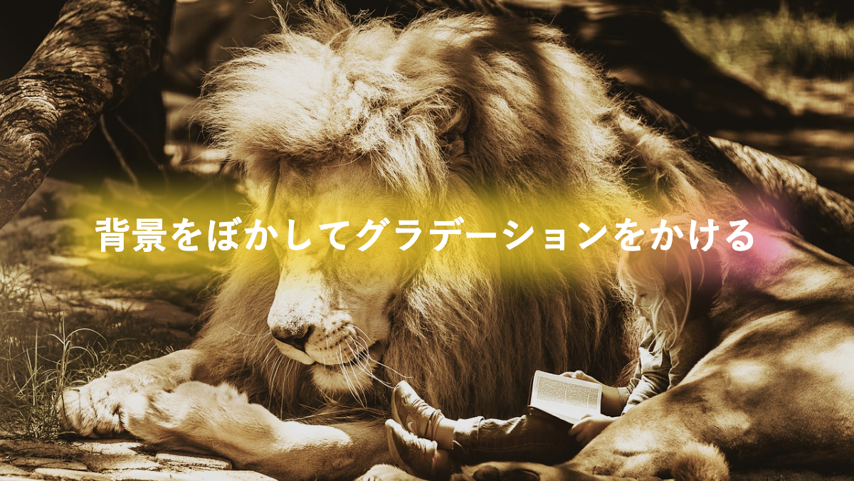
before疑似要素に「linear-gradient」指定し、透過グラデーションをかける。「filter」プロパティに「blur」を指定しぼかしを入れてます。
CSS表示
h2 {
    position: relative;
    padding: 1rem;
    border-radius: 0.2rem;
    margin-bottom: 0.5rem;
    color: white;
    font-weight: bold;
    font-size: 26px;
}

h2:before {
    position: absolute;
    top: 0;
    left: 0;
    width: 100%;
    height: 100%;
    background-image: linear-gradient(315deg, rgba(222, 77, 170, .7) 0%, rgb(246, 211, 39, .7) 30%);
    filter: blur(10px);
    content: "";
    z-index: -1;
}
文字や背景画像が変更可能。また画像を含めたHTML・CSSを取得できます
枠と文字をグラデーションにした見出し
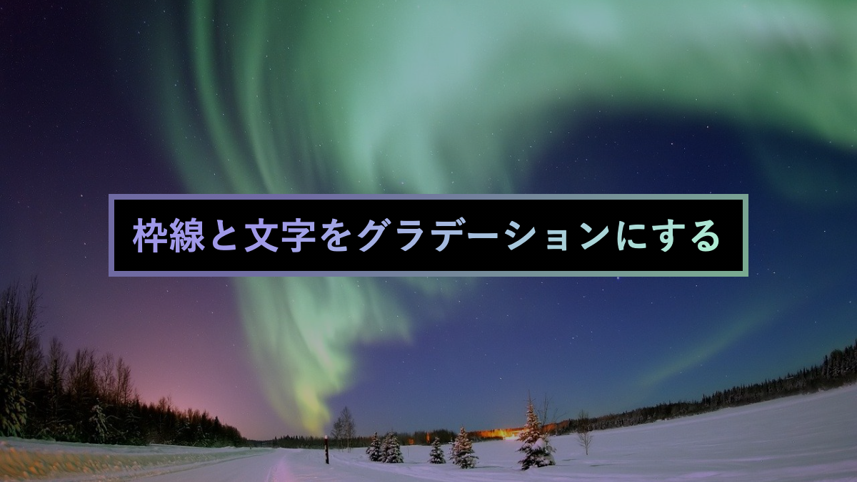
「–gradient」カスタムプロパティに文字と枠線のグラデーションを入れる。-webkit-background-clip: text;で文字にグラデーションをかけてます。
CSS表示
h2 {
    --gradient: linear-gradient(315deg, #aff6cf 0%, #9f98e8 74%);
    position: relative;
    padding: 1rem;
    margin-bottom: 0.5rem;
    background-image: var(--gradient);
    -webkit-background-clip: text;
    color: transparent;
    font-weight: bold;
    font-size: 26px;
}

h2:before {
    position: absolute;
    top: 0;
    left: 0;
    width: 100%;
    height: 100%;
    background-image:
        linear-gradient(black 0 100%),
        var(--gradient);
    background-position: center;
    background-repeat: no-repeat;
    background-size: calc(100% - 0.5rem) calc(100% - 0.5rem), 100% 100%;
    content: '';
    z-index: -1;
}
文字や背景画像が変更可能。また画像を含めたHTML・CSSを取得できます
上下の線をグラデーションにした見出し
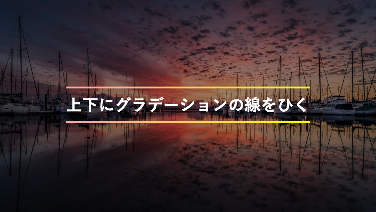
background-imageに2つのlinear-gradientを指定。高さを3pxにし、background-positionで上下にグラデーションの境界線を表示してます。
CSS表示
h2 {
    --gradient: linear-gradient(45deg, #FFA8A8 10%, #FCFF00 100%);
    padding: 1rem 0;
    margin-bottom: 0.2rem;
    background-image:
        var(--gradient),
        var(--gradient);
    background-repeat: no-repeat;
    background-size: 100% 3px;
    background-position: bottom, top;
    color: white;
    font-weight: bold;
    font-size: 26px;
}
文字や背景画像が変更可能。また画像を含めたHTML・CSSを取得できます
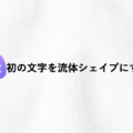
最初の文字をグラデーションにした見出し
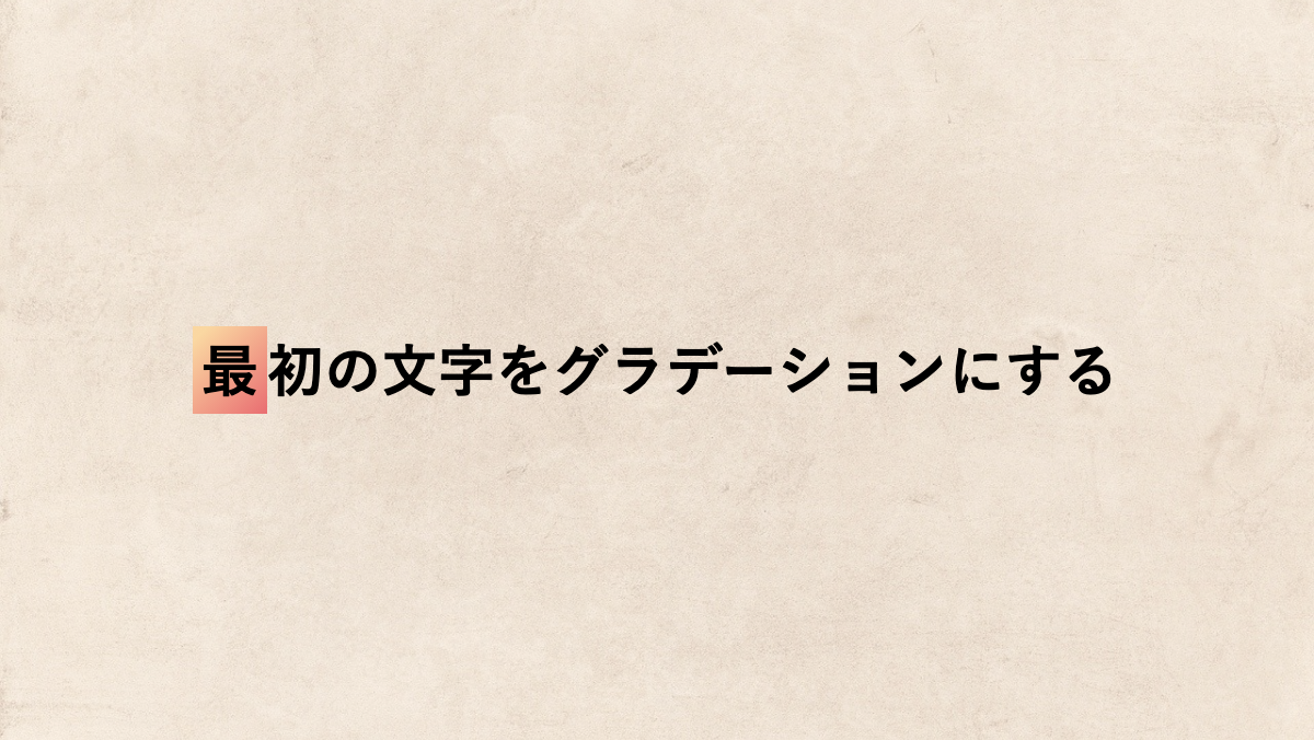
first-letter疑似要素で最初の文字をオレンジのグラデーションにしています。
CSS表示
h2 {
    padding: 1rem;
    border-radius: 0.3rem;
    background-color: black;
    color: white;
    font-size: 26px;
    font-weight: bold;
}

h2::first-letter {
    padding: 0.3rem;
    background-image: linear-gradient(135deg, #FAD7A1 10%, #E96D71 100%);
}
文字や背景画像が変更可能。また画像を含めたHTML・CSSを取得できます
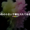
グラデーションの小さい線を入れた見出し
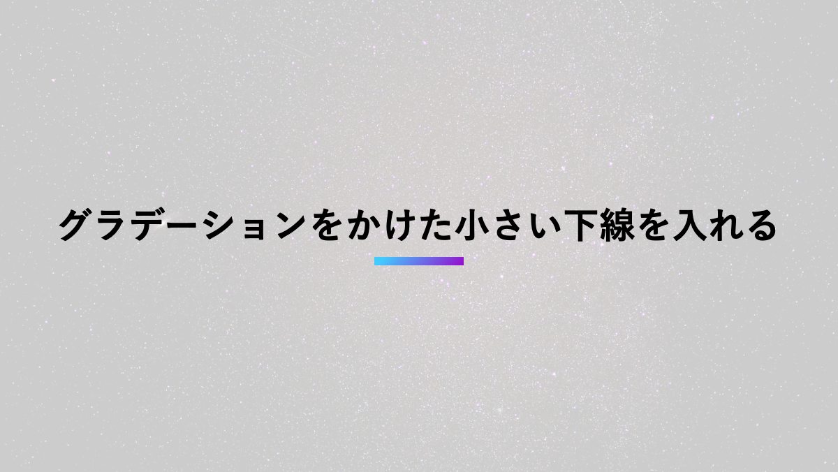
background-sizeで幅4rem、高さ0.4remに指定。background-position下部に表示し小さな下線を作ってます。
CSS表示
h2 {
    position: relative;
    padding: 0.5rem 0 1rem;
    margin-bottom: 0.5rem;
    font-weight: bold;
    font-size: 26px;
    background-image: linear-gradient(135deg, #43CBFF 10%, #9708CC 100%);
    background-repeat: no-repeat;
    background-size: 4rem 0.4rem;
    background-position: bottom;
}
文字や背景画像が変更可能。また画像を含めたHTML・CSSを取得できます
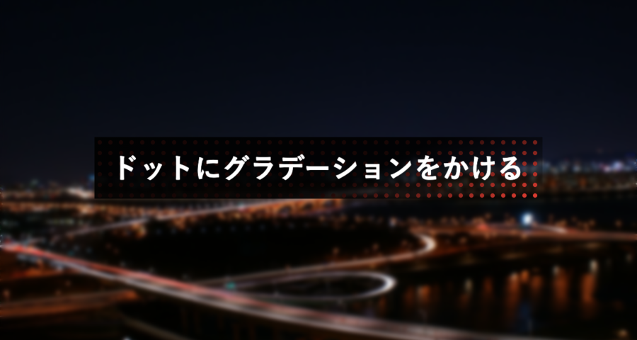
ドットにグラデーションをかけた見出し
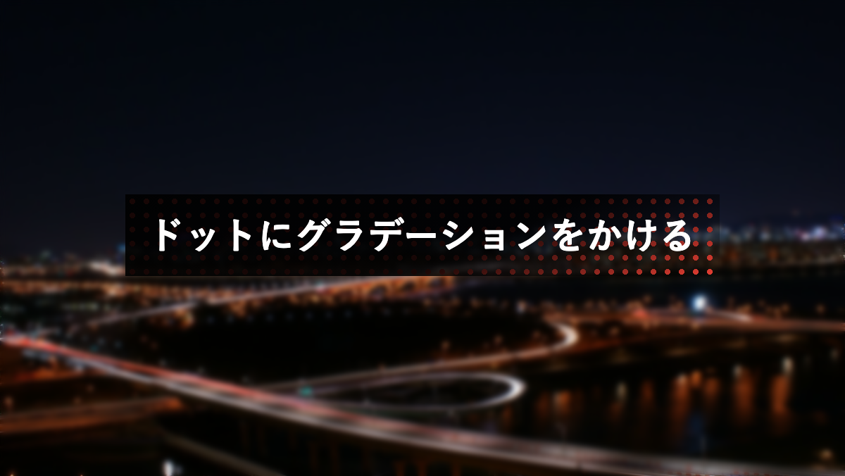
background-imageで2つのグラデーションを指定。「linear-gradient」で黒いグラデーションをかけ「radial-gradient」でドットパターンを作成しています
CSS表示
h2 {
    padding: 1rem;
    margin-bottom: 0.2rem;
    background-image:
        linear-gradient(155deg, rgba(0, 0, 0, .9) 60%, transparent),
        radial-gradient(#e93f33 30%, transparent 30%);
    background-repeat: no-repeat, repeat;
    background-size: 100% 100%, 10px 10px;
    color: white;
    font-weight: bold;
    font-size: 26px;
}
文字や背景画像が変更可能。また画像を含めたHTML・CSSを取得できます
以上がCSSでグラデーションをかけた見出しデザインとなります。
「background-image」に複数のグラデーションを指定し、サイズや位置を調整すると色々な表現が可能となります。他にも思いついたら随時追加していく予定です。


コメントを残す